
Party of Sin is an Xbox Live Arcade game that is currently in development by CrankShaft Games. They've been hard at work on their project since I first learned about it in March and over the course of just a few months, they have really been chipping away at the style of the game. Watching the development of games is something I have always enjoyed because of the drastic changes that can occur, so developers who document their process well will always receive tons of attention from me in this regard.
The first few updates on the website explain the process of designing each character, with Greed, Lust, and Pride each having a unique process. The over all design of the characters is interesting and I've always enjoyed seeing how people arrive at different designs. Concept art is one of favorite things to behold because of the many changes characters can go through. The CrankShaft team really has their work cut out for them, because they are personifying each of the seven deadly sins.
This past week the team finally released a few alpha screenshots of the game to the public and asked for opinions and concrit. I was happy to see what the team had come up with, but a few glaringly obvious things stuck out at me like a sore thumb, especially after having just played through Darksiders and Dante's Inferno a few months ago.

The above screenshot is a division of a before and after, only reversed. The side on the left is what the prototype of the game looks like now, while the side on the left is the first screenshot of the same area before any improvements were made.
Alexander Galasso contacted me on Twitter and let me know when the screenshots had been released on the Party of Sin IndieDB.com profile, specifically asking for my input. Here is what I had to say about the right hand side of the above image:
First of all, I want to say kudos on getting these shots up. I really love the cartoony feel you guys are going for the game, as it is one of my favorite art styles. That being said, I do have a few suggestions.The team responded positively to my suggestions and as you can see by the left hand side, several improvements have been made. One of the improvements I suggested was lighting to help the player discern a path. As you can see in the header image, torches are now placed periodically, which drastically helps improve a player's understanding of where they should be going.
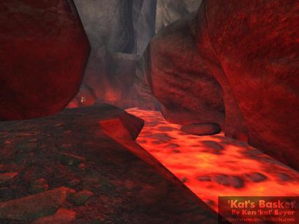
In the first screenshot, I know you said you're not finished with the lava and you mention the edges, but the entirety of the lava looks very static (but it's a screenshot! I know, I know). Lava is very mobile even in large pits. It's constantly flowing moving, bubbling. It's also extremely hot and is a form of a light source because of the super heated temperature. The edges and walls of the cliff beneath the bridge should be displaying some of this light. Sounds silly, I know, but check out these screenshots:
Katsbits.com
MousePlanet.com
See how the light generated by the lava hits the walls? You're missing this so it makes the images look a little flat. The same could be said for the skybox. It looks very much like a 2D background and I think this could be changed by a slight alteration of the color so that it is lighter on bottom (closer to the source) and darker towards the top of the screen.
Aside from the issues with the lava not feeling real enough, I'd say the rest of it looks pretty damned good. Lava that is fixed in the second screenshot would improve it immensely, and the third screenshot does look a tad cluttered, but that's because my eyes can't easily discern where I should be going if I were playing the game. Light sources are a good way to draw the players eye from point to point, so you might want to consider using them for directional as well as aesthetic purposes. If you've ever played any Valve game and you get lost, always remember: Head toward the light.
The lava has also been much improved, since even in a screenshot you can tell that it is a moving, bubbling mass of fire. A post on the official Party of Sin website released the new screenshots with the following to say about them:
Some of the improvements that are still needed are related to the background and the lava. As of now, it is really bright and clips with both the walls and background. It doesn’t look smooth at all. We haven’t yet implement Overlorder’s [sic] idea of inserting a glow around the lava. This should come into effect within the next couple of weeks.I'm definitely excited to see all of these changes because they are a drastic improvement over what was shown only a week ago. This shows that the team is taking input seriously in order to make the best looking game possible, which can only bode well for future development. Even without the lava glow that I suggested, the fog that now resides over the background serves to distinguish the atmosphere from actual gameplay elements, making it a 100% improvement in terms of understanding what you can interact with and what you can't.